> This page is for Flowkit CSS Framework, version v2 (default).
> For other versions, use one of these documentation indexes:
> - v2 (default): https://developers.webflow.com/flowkit/v2.0.0/llms.txt
> - v1: https://developers.webflow.com/flowkit/v1.0.0/llms.txt
> For clean Markdown of any page, append .md to the page URL.
> For a complete documentation index, see https://developers.webflow.com/llms.txt.
> For AI client integration (Claude Code, Cursor, etc.), connect to the MCP server at https://developers.webflow.com/_mcp/server.
# Flowkit Framework
> How classes and utilities were structured in the legacy Flowkit Framework.
## Introduction
Flowkit is a modular CSS Framework designed to power visually consistent and flexible Webflow websites — especially those generated by Webflow AI. It provides a structured collection of reusable utility classes, component patterns, and design tokens that streamline layout, styling, and interactions across your entire site.
Built with scalability and clarity in mind, Flowkit helps:
* Maintain design consistency through [global variables](https://help.webflow.com/hc/en-us/articles/33961268146323-Variables)
* Style and compose layouts using utility-first [classes](https://help.webflow.com/hc/en-us/articles/33961311094419-Classes)
* Build and extend [component systems](https://help.webflow.com/hc/en-us/articles/33961303934611-Components-overview) with predictable class conventions
---
## Style guide
The Flowkit style guide provides an overview of all the components and utility classes used in the project. Each website generated by Webflow's AI tools includes a style guide page generated by the Flowkit framework.
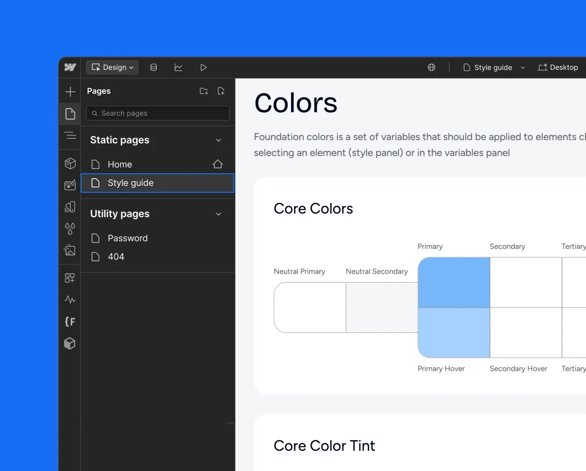
> **Note**
>
> Style guide is a great place to change styles of the elements and components. To change colors, fonts, or spacing, open the variables panel or make the adjustments directly from the Designer canvas.
> [Learn more about variables](https://help.webflow.com/hc/en-us/articles/33961268146323-Variables).
---
## Naming conventions
This framework uses a structured naming system with hyphens and underscores that creates predictable, reusable classes organized into four main types.
### Hyphens ' - ' Usage
Hyphens are used to:
1. Connect multiple words within component names, property names, or values:
* rich-text
* text-align\_center
* margin-top\_small
* background\_primary
2. Define combo class modifiers (component states, surface context, spacing, interactions):
* is-secondary
* on-inverse
* gap-small
3. Responsive modifiers for combo classes:
* flex\_horizontal tablet-vertical
* grid\_5-col mobile-2-col
### Underscores ' \_ ' Usage
Underscores are used to:
1. Separate components from their parts or properties:
* card\_body
* nav\_logo
* footer\_link
2. Connect utility properties with their values:
* margin-top\_small
* width\_40percent
* z-index\_2
3. Apply responsive variants of utility classes by adding breakpoint postfixes:
* text-align\_center\_mobile — center-aligned text on mobile
* width\_100percent\_mobile-l — full width on large mobile
> **Responsive modifiers: \`\_\` vs \`-\`**
>
> There is a clear distinction between **`_`** and **`-`** when working with responsive utility classes in Flowkit:
>
> * **`_mobile`** is used within **utility classes** to apply styles only at a specific breakpoint.
> Example:
> text-align\_center\_mobile means the text will be center-aligned **only on mobile**.
> This class is **scoped to mobile resolution** and does not apply on tablet or desktop.
>
> * **`mobile-`** is used as a **combo modifier** to override or change a base style on mobile.
> Example:
> text-align\_center mobile-align-left
> This means the text is center-aligned by default, but switches to left-aligned **on mobile**.
>
> Use `_mobile` when you want a utility to appear **only at a certain breakpoint**, and `mobile-` (or similar prefixes) when you want to **override an existing style** responsively using a combo class.
---
## Class types
There are four main types of classes: `Component`, `Utility`, `Combo`, and `Responsive Modifiers`. Each of these class types follows specific naming patterns for consistency and clarity.
### Component classes
Component classes define standalone UI elements with their own structure and functionality.
**Naming Pattern:** component\_property or component\_part\_property
| Example | Purpose |
| ------------ | -------------------------------------------------- |
| card | Flexible content container with shadow and padding |
| card\_body | The body part of a card component |
| nav | Main website navigation bar |
| nav\_logo | The logo part of a navigation component |
| footer\_link | A link element within the footer |
| footer | Site-wide footer container |
| button | Reusable clickable element |
| banner | Promotional or announcement container |
Component classes define reusable building blocks of the UI and may have nested sub-elements, with naming that follows the parent component.
Here is an example of a Nav component with its nested elements:
nav nav\_links
nav\_logo-icon \
nav\_link
---
### Utility classes
Utility classes provide single-purpose styling that can be applied to any element.
**Naming Pattern:** property\_value
| Example | Purpose |
| ------------------------- | ----------------------------------- |
| margin-top\_medium | Applies medium top margin |
| padding-horizontal\_large | Applies large padding on both sides |
| z-index\_2 | Sets z-index to 2 |
| background\_primary | Sets background to primary color |
| text-align\_center | Centers text horizontally |
| text-align\_left | Applies left text alignment |
| text-align\_right | Applies right text alignment |
| display\_inline-block | Applies inline-block display |
> **Note**
>
> Utility classes may apply multiple CSS properties, but always serve a single visual purpose.
---
### Combo classes
Combo classes are modifiers that change the appearance or behavior of components. They use specific prefixes to indicate their purpose.
| Prefix | Purpose |
| --------------------------- | ----------------------------------- |
| is- | Component-related modifiers |
| on- | Surface context modifiers |
| gap- | Spacing modifiers for flex and grid |
| ix- | Interactions related |
| tablet-, mobile-l-, mobile- | Responsive modifiers |
Combo classes are always following a main class: `main class` `prefix`-`modifier-name`
| Example | Purpose |
| --------------------------- | ---------------------------------------------- |
| button is-secondary | Changes button to secondary style |
| text-link on-accent-primary | Adapts text link for accent-primary background |
| flex\_horizontal gap-medium | Sets medium gap in flex container |
| section is-secondary | Adjust section background and text color |
---
### Responsive modifiers
Responsive modifiers apply styles at specific breakpoints. They use device-specific postfixes.
**Postfix:**
* \_tablet - Tablets
* \_mobile-l - Mobile landscape
* \_mobile - Mobile portrait
| Example | Purpose |
| -------------------------- | -------------------------------------------------- |
| width\_100percent\_tablet | Changes an element to full width on tablet screens |
| text-align\_center\_mobile | Centers text on mobile screens |
---
## Sizes
T-shirt sizing provides a consistent way to name size-related classes for things like spacing, borders, text, and icons.
| Size | Example |
| ------- | -------------------- |
| xxsmall | icon is-xxsmall |
| xsmall | icon is-xsmall |
| small | radius\_small |
| medium | text\_medium |
| large | gap\_large |
| xlarge | radius\_xlarge |
| xxlarge | padding-top\_xxlarge |
This scale applies to layouts, spacing, typography, shadows, and other properties.
---
## Surface modifiers
The following surface modifiers are used across button, text, nav, icon, and card components. These follow the on-\[surface] naming structure and appear in combinations for alternate background styling.
| Surface | Example |
| ---------------- | ------------------------------------- |
| Accent Primary | button is-secondary on-accent-primary |
| Accent Secondary | text-link on-accent-secondary |
| Accent Tertiary | icon on-accent-tertiary |
| Primary | card-link on-primary |
| Secondary | card-link on-secondary |
| Inverse | button on-inverse |
---
## Animation modifiers
Animation-related classes that are used in [Webflow Interactions](https://help.webflow.com/hc/en-us/articles/33961310025107-Intro-to-Interactions) follow the ix\_ prefix convention. These classes are not responsible for styling but act as hooks for applying interactions and animations defined in the Webflow Interactions panel.
Examples:
| Example | Purpose |
| --------------------- | ----------------------------------------------------- |
| ix\_section-scroll-in | Triggers scroll-based entrance animation for sections |
| ix\_image-zoom-hover | Targets images that scale on hover |
| ix\_nav-slide-out | Animates navigation on mobile menu toggle |
| ix\_button-tap | Adds tap/click animation to buttons |
| ix\_card-flip | Triggers flip animation for card components |