Visibility

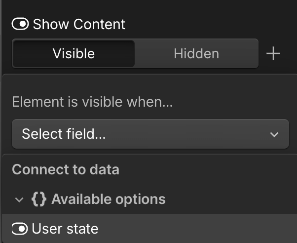
Add a Visibility property to your component to choose whether to show or hide elements in Webflow.

Syntax

1// Prop definition
2props.Visibility({
3 name: string,
4 group?: string,
5 tooltip?: string,
6 defaultValue?: boolean,
7})
8
9// Prop value
10boolean

Prop definition

Define the Visibility prop in your Webflow code component with a name. Optionally, you can add a group, tooltip text, and a default value.

1props.Visibility({
2 name: string,
3 group?: string,
4 tooltip?: string,
5 defaultValue?: boolean,
6})

Properties

  • name: The name for the property.
  • group: The group for this property. (optional)
  • tooltip: The tooltip for the property. (optional)
  • defaultValue: Default visibility state. (optional)

Example

MyComponent.webflow.tsx
1import { declareComponent } from '@webflow/react';
2import { props } from '@webflow/data-types';
3import { MyComponent } from "./MyComponent";
4import "../styles/globals.css";
5
6export default declareComponent(MyComponent, {
7 name: "MyComponent",
8 description: "A component with a Visibility property",
9 props: {
10 isVisible: props.Visibility({
11 name: "Show Element",
12 group: "Display",
13 defaultValue: true
14 })
15 }
16});

Prop value

The Visibility prop provides a boolean value to your React component.

1boolean

Properties

  • n/a

Webflow properties panel

Visibility property in the Webflow panel

Example

MyComponent.tsx
1import React from "react";
2import "../styles/globals.css";
3
4interface MyComponentProps {
5isVisible?: boolean;
6}
7
8export const MyComponent = ({ isVisible }: MyComponentProps) => {
9if (!isVisible) return null;
10
11return (
12 <div className="element">
13 This element is visible
14 </div>
15);
16}
## When to use
Use a Visibility prop when you want designers to:
- Show or hide elements conditionally
- Control component display states
- Create toggled content
- Build conditional layouts
## Best practices
- Provide sensible default values
- Handle hidden states gracefully
- Consider accessibility implications