Element settings
This guide provides best practices for working with element settings, ensuring your components are semantic, accessible, and easily integrated into your React applications.
Element tags
Some Webflow elements let you override or bind their HTML tag at runtime. This is useful for keeping your exported components semantic and accessible without creating duplicate versions of the same component.
Headings
Heading elements in Webflow have a Tag setting. With components, you can bind this setting to a prop, then set the tag at runtime. This allows you to reuse the same Heading component across different contexts, while keeping your document outline accessible and SEO-friendly.
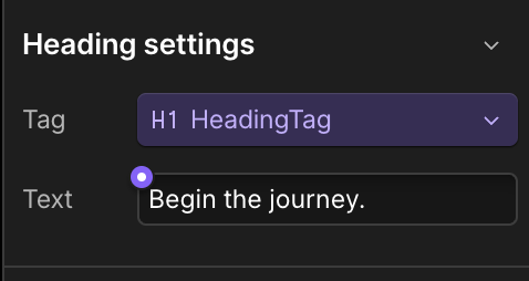
In React, you can set the tag at runtime by passing the prop to the component.
Custom identifiers
You can add custom IDs and custom attributes to elements in the Designer. DevLink automatically transforms custom IDs into safe, namespaced selectors using CSS Modules, preventing style conflicts when components are used in larger React apps.
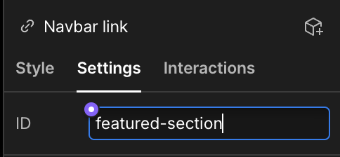
DevLink transforms custom IDs into the following format upon export:
For example, a custom ID of featured-section on a Grid element within a Hero component may become: Hero_featured-section__abc123
This ensures that each identifier is unique, even if multiple instances of the component appear on the page.
Dynamic IDs
Some Webflow elements (like Grid or Quick Stack) use built-in IDs as styling hooks. These IDs appear in the Style Panel with a pink marker. If you make them dynamic in React, Webflow’s generated CSS selectors will no longer match, and your styling will break.
Don’t replace Webflow IDs dynamically in React, because Webflow’s generated CSS selectors will no longer match.
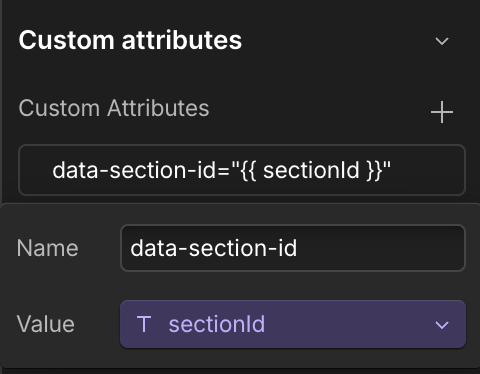
Custom attributes
Instead of replacing IDs, attach your own custom attributes. This keeps Webflow’s CSS intact while still giving you dynamic identifiers for React logic.
Custom attributes are renamed or suppressed when you export code with DevLink; see Name changes.
Adding custom attributes in Webflow
Select the element you want to add a custom attribute to, then navigate to the element’s settings panel. Scroll down to the Custom Attributes section and click the + button to add a custom attribute with a name and value.