Page Structure
Page Structure
The Webflow CSS Framework uses a semantic and component-based layout system. Here’s a typical page layout using semantic tags:
Page – tag: Body, selector: Body (All Pages)
Navigation – tag: nav, class: nav
Section – tag: section, class: section
Container – tag: div, class: container
Layout – e.g., grid, flex, card
Footer – tag: footer, class: footer
Page structure
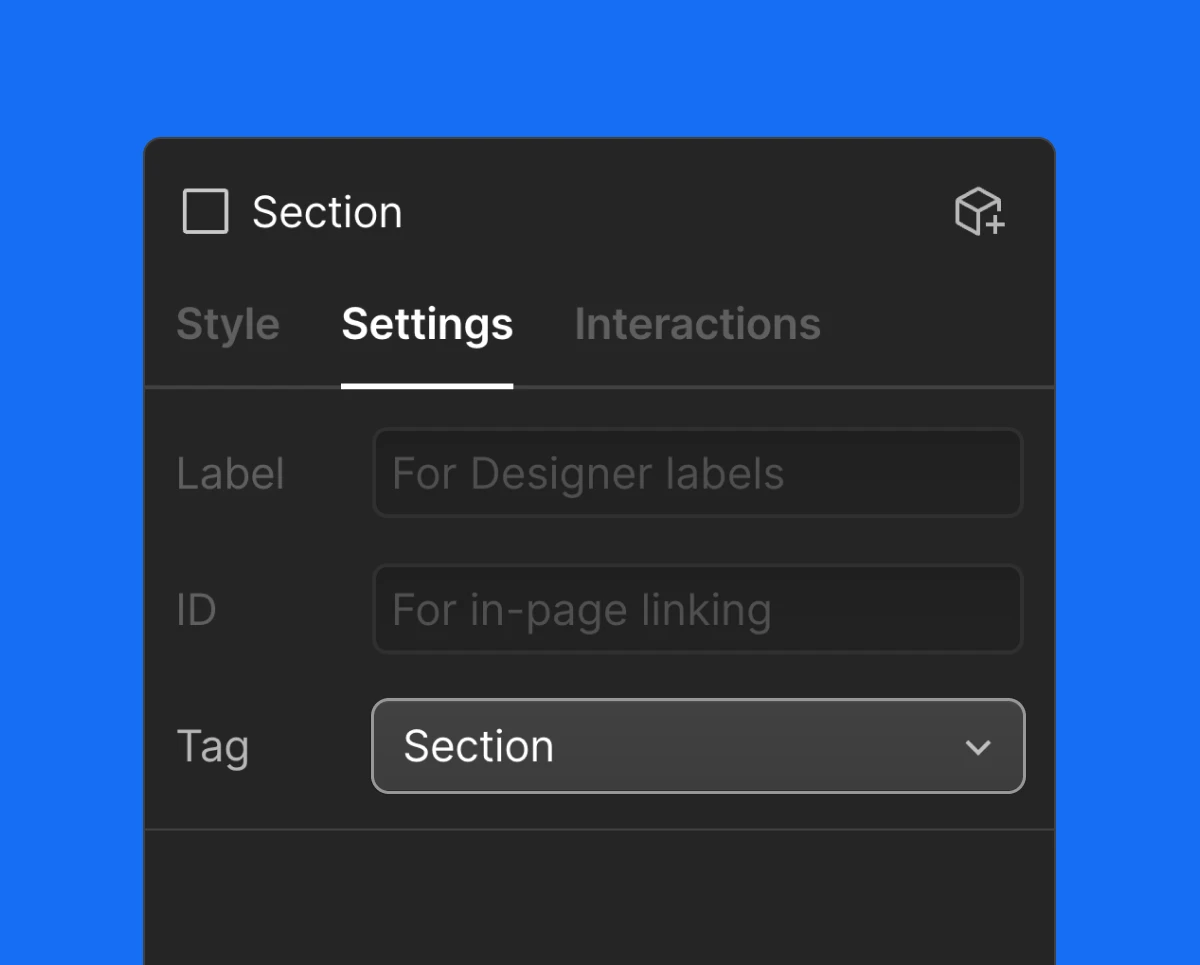
Section
Sections are the core layout blocks of a page. Each section must use the semantic Section tag, which can be set in the Webflow Settings Panel.
Variations
The main class section sets the section’s structure and default padding. Variations are applied with combo classes to adjust background and font colors. Combo classes follow the pattern: section is-secondary
- section is-secondary
- section is-accent-primary
- section is-accent-secondary
- section is-accent-tertiary
- section is-inverse
Padding
The section class includes vertical padding by default. Use utilities to adjust:
Container
The container class centers content and applies a max-width with internal horizontal padding. It ensures consistent alignment across all layouts.
These combo classes adjust the width:
Padding Control
Adjust internal padding using utility classes:
- padding-horizontal_none — removes side padding
Navigation
The navigation bar uses the semantic nav tag and a base class Nav.
Navigation adapts to the background color using combo classes:
- nav is-accent-primary
- nav is-accent-secondary
- nav is-accent-tertiary
- nav is-inverse
- nav is-secondary
Footer
Footer uses footer semantic tag and class Footer.
Footer also adapts to the background color using combo classes:
- footer is-secondary
- footer is-inverse
- footer is-accent-primary
- footer is-accent-secondary
- footer is-accent-tertiary
Every footer variation has a combo class for a footer link footer_link on-inverse or on-accent-primary etc.