Units
Overview
The primary unit of the framework is REM. It’s used for sizing, spacing, and typography to ensure flexibility and accessibility. Other units also used based on the use-cases. Here is the list of all the units used:
Why do we use REM?
REM (short for “root em”) is the foundation of our unit system.
- It scales based on the root
<html>font size (by default16px) - It makes spacing and typography fluid-responsive and consistent
- It improves accessibility and user control
If 1rem = 16px, then:
You can override the base by embedding a rule in your Webflow project custom code:
Pro Tip
To see the font size change reflected in the Webflow Designer, it’s best to place this code inside a Code embed element within a reusable Component. This ensures the override is included on every page of your project.
REM in Webflow
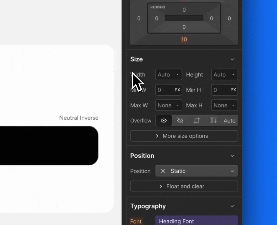
Webflow supports REM-based math directly in input fields. You can type formulas like 64/16 hit ↵ and get a result of 4. In Webflow PX is the default unit, you can switch to REM by clicking on units indicator and select REM, or simply add 64/16REM, hit ↵ and get 4 REM.