

Flowkit Framework
Introduction
Flowkit is a modular CSS Framework designed to power visually consistent and flexible Webflow websites — especially those generated by Webflow AI. It provides a structured collection of reusable utility classes, component patterns, and design tokens that streamline layout, styling, and interactions across your entire site.
Built with scalability and clarity in mind, Flowkit helps:
- Maintain design consistency through global variables
- Style and compose layouts using utility-first classes
- Build and extend component systems with predictable class conventions
Style guide
The Flowkit style guide provides an overview of all the components and utility classes used in the project. Each website generated by Webflow’s AI tools includes a style guide page generated by the Flowkit framework.
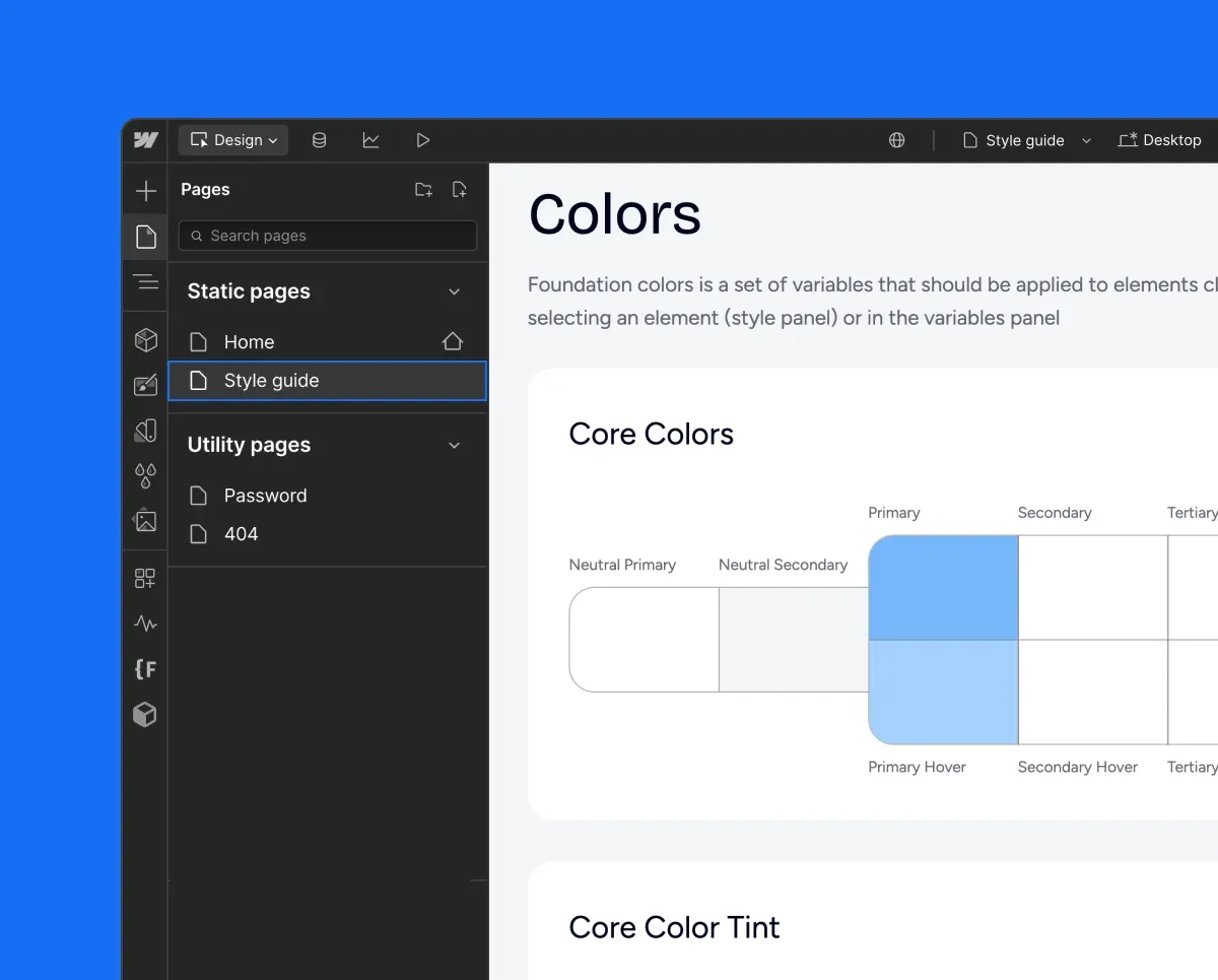
Style guide is a great place to change styles of the elements and components. To change colors, fonts, or spacing, open the variables panel or make the adjustments directly from the Designer canvas. Learn more about variables.
Naming conventions
This framework uses a structured naming system with hyphens and underscores that creates predictable, reusable classes organized into four main types.
Hyphens ’ - ’ Usage
Hyphens are used to:
- Connect multiple words within component names, property names, or values:
- rich-text
- text-align_center
- margin-top_small
- background_primary
- Define combo class modifiers (component states, surface context, spacing, interactions):
- is-secondary
- on-inverse
- gap-small
- Responsive modifiers for combo classes:
- flex_horizontal tablet-vertical
- grid_5-col mobile-2-col
Underscores ’ _ ’ Usage
Underscores are used to:
- Separate components from their parts or properties:
- card_body
- nav_logo
- footer_link
- Connect utility properties with their values:
- margin-top_small
- width_40percent
- z-index_2
- Apply responsive variants of utility classes by adding breakpoint postfixes:
- text-align_center_mobile — center-aligned text on mobile
- width_100percent_mobile-l — full width on large mobile
Responsive modifiers: _ vs -
There is a clear distinction between _ and - when working with responsive utility classes in Flowkit:
-
_mobileis used within utility classes to apply styles only at a specific breakpoint. Example: text-align_center_mobile means the text will be center-aligned only on mobile. This class is scoped to mobile resolution and does not apply on tablet or desktop. -
mobile-is used as a combo modifier to override or change a base style on mobile. Example: text-align_center mobile-align-left This means the text is center-aligned by default, but switches to left-aligned on mobile.
Use _mobile when you want a utility to appear only at a certain breakpoint, and mobile- (or similar prefixes) when you want to override an existing style responsively using a combo class.
Class types
There are four main types of classes: Component, Utility, Combo, and Responsive Modifiers. Each of these class types follows specific naming patterns for consistency and clarity.
Component classes
Component classes define standalone UI elements with their own structure and functionality.
Naming Pattern: component_property or component_part_property
Component classes define reusable building blocks of the UI and may have nested sub-elements, with naming that follows the parent component.
Here is an example of a Nav component with its nested elements:
navnav_link
Utility classes
Utility classes provide single-purpose styling that can be applied to any element.
Naming Pattern: property_value
Utility classes may apply multiple CSS properties, but always serve a single visual purpose.
Combo classes
Combo classes are modifiers that change the appearance or behavior of components. They use specific prefixes to indicate their purpose.
Combo classes are always following a main class: main class prefix-modifier-name
Responsive modifiers
Responsive modifiers apply styles at specific breakpoints. They use device-specific postfixes.
Postfix:
- _tablet - Tablets
- _mobile-l - Mobile landscape
- _mobile - Mobile portrait
Sizes
T-shirt sizing provides a consistent way to name size-related classes for things like spacing, borders, text, and icons.
This scale applies to layouts, spacing, typography, shadows, and other properties.
Surface modifiers
The following surface modifiers are used across button, text, nav, icon, and card components. These follow the on-[surface] naming structure and appear in combinations for alternate background styling.
Animation modifiers
Animation-related classes that are used in Webflow Interactions follow the ix_ prefix convention. These classes are not responsible for styling but act as hooks for applying interactions and animations defined in the Webflow Interactions panel.
Examples: