For AI agents: a documentation index is available at the root level at /llms.txt and /llms-full.txt. Append /llms.txt to any URL for a page-level index, or .md for the markdown version of any page.
Resources
Get started
ReferenceChangelog
ReferenceChangelog
  • Flowkit v2.0.0
      • Introduction
      • Units
    • Components
    • Utility Classes
LogoLogo
Resources
Get started
On this page
  • Overview
  • Why do we use REM?
  • REM in Webflow
Flowkit v2.0.0Getting Started

Units

Was this page helpful?
Previous

Variables Overview

Next
Built with

Overview

The primary unit of the framework is REM. It’s used for sizing, spacing, and typography to ensure flexibility and accessibility. Other units are also used based on the use-case. Here is the list of all the units used:

CategoryUnitPrimary UsesDescription
ResponsiveREM
  • Typography
  • Spacing
  • Components
Scales with root font size (default: 16px)
EM
  • Button padding
  • Icon sizes
Scales with parent element’s font size
Layout%
  • Container widths
  • Max-widths
Relative to parent element’s size
FR
  • Grid columns
  • Grid layouts
Distributes available space in CSS Grid
ViewportVH/VW
  • Hero sections
  • Full-height layouts
Relative to viewport dimensions
DVH
  • Mobile layouts
  • Dynamic heights
Adjusts for mobile browser chrome
SpecialPX
  • Borders
  • Shadows
Fixed-size elements (use sparingly)
CQWFluid typographyCharacter-width-based unit for responsive typography. Requires heading-responsive_wrapper

Why do we use REM?

REM (short for “root em”) is the foundation of our unit system.

  • It scales based on the root <html> font size (by default 16px)
  • It makes spacing and typography fluid-responsive and consistent
  • It improves accessibility and user control

If 1rem = 16px, then:

REMPixels
0.5rem8px
1rem16px
2rem32px

You can override the base by embedding a rule in your Webflow project custom code:

1<style>
2 html { font-size: 20px; } /* 1rem now equals 20px */
3</style>
Pro Tip

To see the font size change reflected in the Webflow Designer, it’s best to place this code inside a Code embed element within a reusable Component. This ensures the override is included on every page of your project.


REM in Webflow

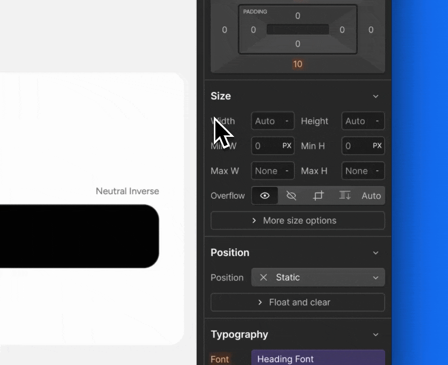
Webflow supports REM-based math directly in input fields. You can type formulas like 64/16 hit ↵ and get a result of 4. In Webflow PX is the default unit, you can switch to REM by clicking on units indicator and select REM, or simply add 64/16REM, hit ↵ and get 4 REM.

Style Guide