Quick start: DevLink Import
Quick start: DevLink Import
This quickstart guides you through creating an example React component library for Webflow projects. To configure your existing codebase for component import, see the installation reference.
What you’ll accomplish:
- Set up your development environment
- Declare a Webflow code component with props
- Share your component library to Webflow
- Use your component in a Webflow project
Before you start
Before running this quickstart, make sure you have:
- A Webflow account with Workspace access
- A Webflow site where you can test components
- Node.js 22.13.0 or higher and npm installed
- Basic familiarity with React components and TypeScript
1. Setup your development environment
Set up your local development environment to create and share code components.
Clone the template library
Clone the example library and install the dependencies.
Setup and configuration
For the purposes of this quickstart, we’ve handled the setup and configuration for you in this repository. To learn more about configuring your existing codebase for code components, see the installation reference..
2. Define a Webflow code component
Create a code component definition file to map a React component to a Webflow component. In this step, you’ll create a Badge component with two props mapping to the existing Badge.tsx component in the repository.
Create a code component file
In your editor, navigate to the your components directory where you added your Badge component. Create a new file called badge.webflow.tsx. This file will define how your Badge component appears in Webflow.
Import the React component and Webflow functions
Import the necessary dependencies to create your code component: the React component, prop types, styles, and the declareComponent function.
Declare the component
Declare the code component using the declareComponent function.
The declareComponent function takes two parameters:
- Your React component (
Badge) - Configuration options:
name: The name of the componentdescription?: A description of the component (optional)group?: The group the component belongs to (optional)props: The props of the component, which we’ll define in the next step.options?: The options of the component, (optional)
For more information and detailed configuration options for code components, see the component definition reference.
Define the component props
Add configurable properties that users can edit in the Webflow designer.
Add a props object to the declareComponent function. This object defines which properties designers can configure in the Webflow editor, and maps them to appropriate Webflow prop types using the props constructor.
This code component defines two props:
children: A text field for the badge contentvariant: A dropdown with predefined style options
3. Share your library to Webflow
In your terminal, run the following command to upload your library:
The Webflow CLI will:
- Authorize your workspace: The CLI will check for a Workspace authentication token in your
.envfile. If one is not found, the CLI will prompt you to authenticate by opening a browser window to the Workspace authorization page. Authorize a workspace to continue. - Bundle your library: The CLI will bundle your library, and ask you to confirm the components you want to share.
- Upload your library to your Workspace
For more information and detailed configuration options for bundling and importing code components, see the bundling and import reference..
4. Use the component on your Webflow site
Add your component to the canvas and update the props to customize the component.
Add the library to your Webflow project
Install the library on any site in your Workspace to start using your code components.
-
Open any Webflow site in your workspace.
-
Open the Libraries panel by pressing “L” or clicking the
 icon in the left sidebar.
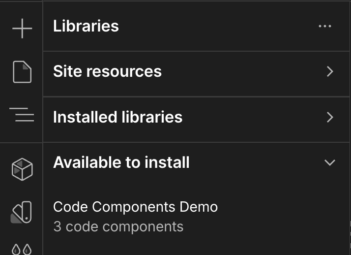
-
Find your library in the list of available libraries.
-
Install the library by clicking the Install icon next to your library.
Open the Components panel
Open the Components panel by pressing “⇧C” or clicking the
 icon in the left sidebar.
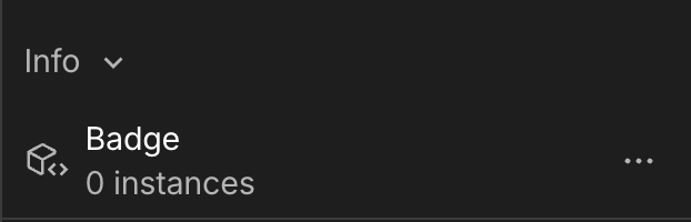
Scroll to the section for the library you just installed. You should see your “Badge” component listed under the “Info” group.
Add the component to your page
Click and drag the Badge component from the components panel onto your page. The component will appear with its default text and styling.
Customize the component
Customize your component in the Properties panel on the right. You’ll see two configurable properties:
- Badge Text: Change the text content of the badge
- Badge Variant: Select from default, secondary, destructive, or outline styling
Try changing the text to “Welcome!” and selecting a different variant to see your component update in real-time.
Congratulations
You’ve successfully created and shared a code component library for your Webflow projects! You now know how to:
- Set up a development environment for code components
- Define a code component with configurable properties
- Share component libraries to Webflow
- Use custom components in your Webflow projects
Next steps
Now that you’ve created your first code component, explore these resources to build more advanced components:
Learn the fundamentals
- Define a code component - Learn how code components work and their architecture
- Prop Types - Explore all available prop types for creating configurable components
- Webflow CLI Documentation - Learn more about the Webflow CLI commands