Grid layout
The base class Grid Layout defines the element as a grid. By default, it creates a 2-column grid layout with no spacing.
Grid Layout can be extended with various combo class modifiers that adjust the layout’s spacing, column count, alignment, and responsiveness. You can combine these modifiers to configure the grid layout to your needs.
Style selector structure:
Grid Layout (Optional) Responsive Column Modifier (Optional) Spacing Modifier (Optional) Alignment ModifierCheck examples how to mix combo-classes:
Grid Layout Desktop 9 Column Tablet 3 Column Mobile Landscape 1 Column Grid Gap MD X Center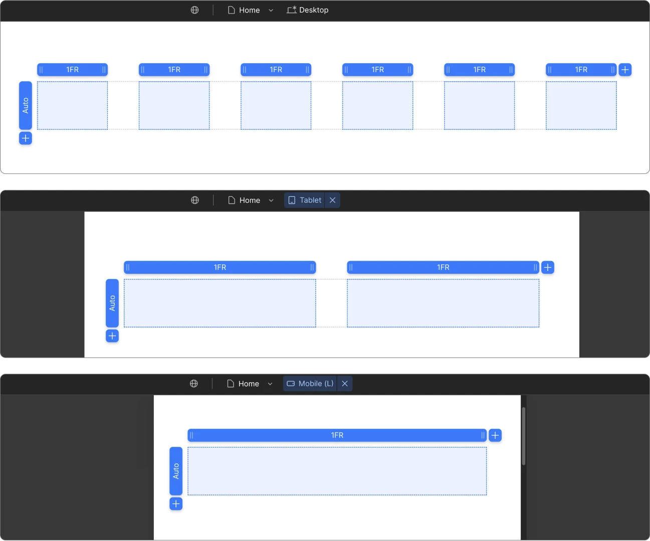
Spacing Modifiers
Spacing is following t-shirt size coding with 2-letter abbreviations (e.g. SM, MD, XL).
Style selector structure:
Grid Layout Grid Gap Size
Options: XXS, XS, SM, MD, LG, XL, XXL
Example: Grid Layout Grid Gap MD
Alignment Modifiers
These modifiers set alignment for all child elements inside the grid.
Style selector structure:
Grid Layout X or Y Position
Options: X Left, X Center, X Right, Y Top, Y Center, Y Bottom
Example: Grid Layout X Center Y Bottom
Responsive Column Modifiers
You can define unique behavior for every breakpoint by adding the combo class for the breakpoint you want to target.
Style selector structure:
Grid Layout Breakpoint Count Column Grid
Options:
Example: Grid Layout Tablet 3 Column Grid