Using props and slots in DevLink Components
Use props to customize Webflow components in React
DevLink converts Webflow’s component properties into fully typed React props, giving you programmatic control over your components. These props come with full TypeScript support and preserve all the defaults and rules set up in Webflow. You can use them to update content, handle user interactions, and control how your components behave in your React app.
Props
DevLink components support two types of props that enable you to customize and extend Webflow components in your React application:
- Basic props: Webflow’s native component properties for content and visibility. The visual editor defines these properties, and DevLink automatically types them in React.
- Runtime props: React-specific features like event handlers and overrides for custom styling.
.d.ts) for type safetyBasic props
Basic props are the most common type of prop to use in DevLink components. These types of props are typically typed when exported and Webflow knows how to handle them (see component properties for list).
- text: Set dynamic text content for elements like buttons, headings, or paragraphs. See more about text and content props in the Webflow help center.
- visibility: Control the visibility of elements or icons within a component. See more about visibility props in the Webflow help center.
Example: Notification button
This Button component has text and visibility props to show the number of new notifications for a user. The text prop sets the number of notifications, while the showThis visibility prop shows/hides the button based on the number of notifications. The buttonProps prop is a runtime prop to handle the click event of the button. We’ll cover runtime props in the next section.
Runtime props
Runtime props extend DevLink components with React-specific functionality that isn’t natively supported in Webflow. When you add a runtime props property to an element, the DevLink compiler automatically adds a corresponding prop to your component and spreads it onto the underlying HTML element. Create runtime props to manage:
- event handling
- set specific inline styles
- override the component class (note: this will make the element lose any pre-existing classes defined in Webflow so this isn’t recommended unless absolutely necessary)
- React refs
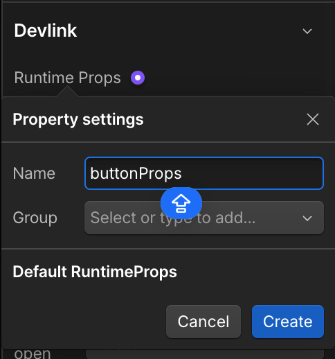
Creating runtime props in Webflow
Add runtime props to your components by selecting a supported element, then navigating to the element’s settings panel. In the DevLink section, you can add runtime props to the element. Only certain elements have support for Runtime Props.
Using runtime props in your React component
DevLink passes runtime props as an object to the component as a prop with the same name as the runtime prop. For example, if you add a buttonProps runtime prop to a button, you can access it in your component as buttonProps.
Slots
A slot is a DevLink-specific property that takes a component as its value. Slots enable you to nest components inside of components within your React project. This is useful when you have custom React components that can’t be built natively in Webflow (for example, if the components rely on third-party libraries or need support for custom logic), but you want to nest them in a Webflow-made component.
Then, you can pass components into the slot property of the React component. For instance, if you have a logo component and a div component with a logoSlot slot property, you can write logoSlot = {<logo / >} to nest the logo inside of your div component.
To set a slot property on an element, create a wrapper div block in the component, then go to the Element settings panel > DevLink > Slot, then connect it to a property.
DevLink slots are different than Webflow Component Slots
DevLink slots enable you to inject custom React components or content into specific areas of an exported React component. In contrast, Webflow Component Slots are used within Webflow’s visual editor to insert Webflow Components into designated areas of a component. We understand this distinction can be confusing. Webflow Component Slots aren’t supported in DevLink.